Posted in Tutorial
tagged with
css,
html,
media queries
Thu 25 Aug 2011 8:19 am
View the demo.
CSS3 media queries are a useful tool to change the layout of a web page depending on the screen size of the device viewing it. There are plenty of examples of how to create a site suitable for mobile or tablet devices using media queries (including this post on my blog), but what about screen sizes larger than the standard desktop layout width of 980 pixels?
Media queries are usually applied to a standard layout. For devices that do support media queries, the layout will be realigned to suit the device, but for those devices that don’t support media queries (such as a PC using IE6), the standard desktop layout will be used.
What’s the problem?
A website using the technique described so far may be viewed by a device which supports media queries (such as a PC using Firefox 6) but has a screen size much larger than 980 pixels (devices with screen sizes over 2,500 pixels in width are quite common), yet will still be viewing a site at 980 pixels wide.
Why optimize a layout for screen sizes of the average layout width and below, but not above the average?
The answer to this question is two fold. Firstly, we still want to deliver the average layout width to devices that don’t support media queries (which means we must build the original layout to 980 pixels in width), and secondly, we will still want to set an upper limit to the width of our design.
We would wish to do this for usability and design decisions, such as keeping the line length of text to the optimum of 60 - 80 characters, and keeping images from being stretched too much and being distorted.
The solution
You have probably seen many layouts using the max-width media feature, but you can also target CSS to devices above a certain width using min-width. Using these two features, we can write media queries that will fit screen sizes from a top limit (in this case it is 1150 pixels, but you can set the top limit to whatever you like), down to a mobile device width of around 320 pixels, but also, as the original design (the CSS before the media queries are applied) is created to 980 pixels, users without media queries will be served the average layout size.
I have created a demo to highlight this process in action. The demo includes a button to toggle media queries on and off (as long as your browser supports JavaScript).
Here is the CSS.
@media screen and (min-width: 1150px) {

   .media-queries .row .center
   {
       width: 1116px;
   }

}

@media screen and (max-width: 1149px) {

   .media-queries .row .center
   {
       width: 96%;
       padding-left: 0;
       padding-right: 0;
   }

}

@media screen and (max-width: 480px) {

   .media-queries .row .center
   {
       padding: 0;
   }

   .media-queries .row .center div
   {
       float: none;
       width: 100%;
       margin: 17px 0;
   }
}
As you can see, we are creating two queries with only 1 pixel in difference, the first to target screens with width of 1150 pixels and everything above (the width of 1116 pixels is due to the padding on the sides of the central div, and the .media-queries class is for toggling the effect in the demo), and the second to devices 1 pixel smaller, at 1149 pixels.
The third screen query is to align the layout to a mobile screen.
Media queries are a very powerful technique, so if just making a layout wider for larger screens is not enough to create a great design, you could use the positioning or display CSS properties to add, rearrange or reposition new or existing elements.
Using this technique makes targeting layouts to screen sizes of both above and below the average easy, so you can create the best user experience for the most users as possible.
Sloppily typed by Nick Pyett
Posted in Tutorial
tagged with
css,
html,
media queries
Thu 30 Jun 2011 3:14 pm
One of the development priorities when I redesigned my website was to use media queries to create a layout that was responsive to as many screen sizes as possible. With the rise of mobile, we can no longer rely on 980 pixel wide layouts delivering the best experience for the various devices being used to browse the web.
Media queries are part of the CSS3 W3C recommendation and can be used to completely restyle a web page depending on the media type (such as print or screen) and media feature of the device’s screen, such as orientation, resolution and colour support. For my site, I shall only be using the media type and width of the screen.
Responsive and Fluid
Many of the sites that use media queries also employ another technique to create a responsive website. Fluid layouts use relative widths (such as percentages) that only fill a portion of the screen width of the device being used, meaning content will fit to all screen sizes. A limitation of fluid layouts is that content cannot be hidden or the layout changed significantly, such as moving entire columns or changing background images.
Media queries used alongside fluid layouts provide the best of both worlds: a design that can fit to a screen size exactly, and a layout that can be realigned depending on that screen size.
Not mobile specific?
Another tactic for creating a device specific website is using device detection and redirecting to a separate dedicated site, usually on a sub-domain such as http://m.example.com. Device detection is a great method if the content of your current standard desktop site is incredibly complex, contains large file sizes or would generally be difficult to scale down for a mobile’s screen.
A lingering problem with device detection is that it is very difficult to predict and detect every single device before it arrives at your site. Granted, most devices can be predicted, and media queries themselves are not supported perfectly in all browsers, but media queries will at least fit all devices that support them perfectly. For both these cases, the worst case scenario is that the user will see the desktop version of the site.
If you do decide to use device detection, what do you do about tablets? You could create another site specifically for tablets, but tablets have a wide range of screen sizes, so it is imperative that you create a fluid design that will fit to all tablet screen sizes. You will now have created three separate websites! This may be the best tactic for your digital marketing strategy, and you could certainly take steps to reuse the content and media, but this may not be within your budget.
If the content on your site is mainly copy with a small amount of images, which could be downloaded easily on a mobile Internet connection, media queries allow you to serve a design specific to the device, without any redirection or creation of multiple websites. This is the case with my blog, and certainly many other blogs and other types of website.
The Beef
Ok let’s finally get down to some code. Firstly, the media queries themselves.
@media screen and (max-width: 940px) {
    /* CSS here creates two-column fluid layout */
}

@media screen and (max-width: 480px) {
    /* CSS here creates single-column fluid layout, realigns header */
}
As you can see, only the two. These are positioned right at the bottom of my CSS file.
The first query will apply the CSS for screen sizes (for media types of screen) no larger than 940 pixels. This is the width of the main content of my website; the central column of 900 pixels and padding of 20 pixels at each side.
Without media queries, the layout of my site would result in a horizontal scroll-bar for screens smaller than 940 pixels. With media queries, I have applied widths measured in percentages for the two column’s containing the main content and aside, and the central column, leaving a small percentage to create a margin at both vertical edges of the page.
I also have a line of CSS to make the images in the page fluid. The image tags themselves do not have any width or height attributes, and the image files are the same width as the column that they are in. With the following line of CSS, they will become fluid and fit to the column.
.col-a article img
{
    width: 100%;
}
Devices with screen widths smaller than 940 pixels wide include the iPad tablet and HTC Desire mobile phone in portrait orientation, among many older desktop monitors and laptops.
The second query creates a single column layout. The aside at the right of the page is moved to below the main content and the header is realigned so that the logo and main navigation are on top of each other and both centrally aligned. The styles from the previous media query mentioned are also still applied, so no need to re-declare styles.
Devices with screen widths smaller than 480 pixels include the iPhone (lower than generation 4) in portrait orientation and the Blackberry Curve in the standard landscape mode.
I wish I could say that was all you had to do, but there are a few more things we must apply before our responsive site works as we want it to for as many devices as possible. Firstly, you must add a few lines of meta data to each page in the head of the document.
<meta name="viewport" content="width=device-width, minimum-scale=1.0, maximum-scale=1.0" />
<meta name="HandheldFriendly" content="true" />
<meta name="MobileOptimized" content="width here" />
The viewport meta data tells mobile browsers that the width of the document should be the same width as the device’s screen. Without this present, a device may use the width of a title or image as the maximum width, meaning a user would have to scroll horizontally.
The MobileOptimized is only used by some IE browsers, and stops the browser attempting to fit the layout of your site to the screen itself. You must specify a width for this. I chose 320 pixels, as it is a good baseline for most mobile sites. The HandheldFriendly meta data does a similar job a range of other mobile browsers.
Poly-fill for Internet Explorer
CSS3 is not implemented in IE older than version 9, but there is a great JavaScript poly-fill available on Google code that will parse your CSS and apply media queries to your site, even in IE. It works well, but has the disadvantage that your CSS is downloaded twice for anyone using IE to view your site, adding to your server load. You may to choose not to support older IE versions, as again the worst case scenario is that users will see the non-responsive desktop site.
<!--[if lt IE 9]>
<script src="http://css3-mediaqueries-js.googlecode.com/svn/trunk/css3-mediaqueries.js"></script>
<![endif]-->
Why You Shouldn’t Just Design for the iPhone
As a final point about design, I would suggest not to design for just one device. Apple’s iPhone is a great way to browse the web, but the strength of media queries is that they are “device agnostic” - they respond to the device’s screen size, rather than the device itself. You should test your design, and decide for which widths you should alter the layout, considering elements of your design such as line length, floats and accessibility of content.
Looking at the analytics for my site, I have had hits from devices based on the mobile operating systems of Android, iOS and SymbianOS in the last month. The mobile web is a real consideration for my site, and this trend is set to continue. Media queries are a great device for creating flexible and responsive web page layouts, and with the tips in the tutorial you should have mobile appropriate content in no time.
Sloppily typed by Nick Pyett
Posted in Article
tagged with
careers
Tue 31 May 2011 11:03 am
If you are wondering how to become a web developer, or have just started down the road, chances are that you will have come across several factors that you feel may block your entry into the industry.
You may think you don’t have the correct equipment, contacts or know-how to become a web development professional. Have you heard people say things like “you need a Mac to develop website properly” or “you must be passionate about design”?
Well, you won’t find any of that here. I’ve been there and come out of the other side with a career in web development.
Clichés are ripe within the web development industry, and they do more harm than good. In an industry where many people contribute their development time for free to open-source projects, it’s much better to try to include a wide variety of people, rather than a select few who, to some, may have the cream of the crop equipment or the contacts that money can’t buy.
So here is a run down of the things that are not essential to becoming a web developer, viable alternatives to them, and advice to try to get you closer to your goals.
1. Any Apple products
The ubiquitous Apple Mac haunts the portfolio of almost every digital agency. If they’re not right there plastered with the agency’s work, they’re being waved about by the staff or just sneaking in at the edge of an office shot.
No doubt, Mac’s are easy to use and aesthetically pleasing, and do lend an air of creativity to a business, but they are expensive, and are certainly not essential to building a website. The computer you are reading this article on is almost certainly powerful enough to build a web site.
I created this site on a PC, with the free tools Notepad++, FileZilla FTP client and XAMPP development environment (for server side programming languages).
2. Any Adobe products
Adobe Photoshop is the industry standard design package for designing websites, and along with Illustrator and Dreamweaver, Adobe’s Creative Suite is a very full featured design package. But again, it’s expensive, and no web development job means no web development money.
There are some great, free graphic design packages, that, while they might not pack in as many features as other paid for packages, are well up to the job of creating media for the web. GNOME distribute free software, including image manipulation software GIMP and the vector drawing tool Inkscape, and are well worth checking out.
3. An encyclopedic knowledge of everything web
I strongly believe that part of my job is to keep up with current web technologies and standards. Things change so fast that if keeping up isn’t one of your priorities, then quite soon you will be less able to deliver the best project work you can.
The flip-side of this is that if you are interested in becoming a web programmer, you will not have to know every technology, every trick and every application - most web developers still don’t. Being positive, adaptable and willing to learn will more than make up for gaps in knowledge.
4. An obsession with web standards
This is a contentious one. Without web standards the web would be much worse off than it is today, and future advancement would be hampered without a clear road-map. Web standards are here to stay and will continue to help developers deliver cross-browser web applications.
However, if you have validated your mark-up to W3C standards and find that you have some errors that you can’t overcome, don’t worry. At the time of writing this article, I checked tumblr.com and amazon.com by the direct input method of the W3C validator and both came back with errors (Amazon had 470!), and people still blog on Tumblr and buy stuff from Amazon.
As an admission, the mark-up of my homepage comes back with one error, due to the tracking code of Google Analytics. If the choice is between obsessing over standards and knowing what’s going down on my website, I’ll take the latter.
5. A “passion” for design
As a web developer you will no doubt have to do some design at some point, from creating a whole web design to adding a new page following a template, but selling yourself as something you are not is a bad idea, and has the potential to ruin any interview.
Do you really think about design twenty-four hours a day? Or do you have much more specific skills that would be of interest to an employer?
6. Any friends within the industry
When I got my first job as a developer, I didn’t know anyone in the industry. I didn’t even really know of anyone. I read a few blogs, but I certainly didn’t have any contacts.
This is a bad position to be in, but just goes to show that a concerted effort in creating a CV and going through the usual channels of job sites and recruitment consultants pays off (thanks Fiona at Perfect Marketing People!).
I probably had about thirty followers on Twitter at the time of my employment and certainly wasn’t going to get a job off any of my mates on Facebook. A social media presence shows that you are digitally inclined and is fully recommended (and come on, it is free), but being a “social media maven” or whatever they call themselves these days certainly isn’t necessary.
8. To be top of Google
Again, I don’t think my website was anywhere for any good search terms on Google (which has changed recently), but I came number one for my name. Just being findable online is a massive help to any bid getting into a digital career.
9. Expensive hosting
If you are going to take the plunge and create your own, hosted website with your own domain (and I advise you do), you don’t need a dedicated server to do it on. You get what you pay for in web hosting, but there are very cheap options for starting out, making it so cheap that you’d be mad not to make your own site.
If you do want a free option, create a blog on Tumblr or Wordpress.com and focus on creating great content.
10. A degree (in computer science)
Degrees are great. They are instant proof that you can be committed to a project and can apply yourself, and will more than likely help you get an interview. But they are not essential for a job as a web dev. I have a degree that is almost completely unrelated to web development (Physics and Philosophy - I did a bit off C++), but this didn’t stop me entering the profession. The thing that got me my first job was experience.
The digital creative industries are mostly quite new; there are very few people who can boast 10 years of experience as a web developer (although there certainly are a few). Also, most agencies will want someone who can, at least in part, hit the ground running when they start.
This means that someone with relevant experience, who are relatively rare, will more likely be offered a position than someone without experience - degree or no degree. But how are you supposed to get a job with no experience, and experience with no job?
Bonus! Three Things You Will Need!
1. Experience
As I’ve already mentioned, making your own site is a great way to gain practice, experience and exposure. A blog is a good place to start, and creating helpful content within a certain niche will help with career focus and SEO within your site.
There are so many free resources online that you should start to teach yourself development as soon as possible. It may seem like a daunting task, but you will be able to put what you have learnt into practice very quickly.
What ever you do, make sure you have an about page with some information about your skills, interests in your spare time and that you are looking for employment, and an easy to find email address so people can get in touch.
2. Experience
If you’ve created yourself a website, why not create one for someone else? There are plenty of charities that will appreciate someone creating them a website. Chances are you will have to take charity gigs for free, but at your stage of career, experience is worth more than money - you can’t buy your way into a job.
You should also ask around your friends and family, and their friends and colleagues. Spread the word that you are prepared to help create a website for someone at a reasonable rate, or just help someone maintain a current website. Getting those URLs on your CV is vital.
3. Experience
Noticing a theme here?
If you’ve created you own site and got some more experience through charities or friends, why not get involved in an open source project? GitHub is a great network full of people who code collaboratively. If you see a project that is of interest to you, why not fork it and add some extra functionality? Or, you could download a project and create a working demo, with blog posts explaining the finer details as you go.
Whatever you do, make sure you get some experience on your CV. You may hit the jackpot and walk straight into a job from college or university, but if you are struggling, or keep getting passed over for people with more experience, it’s time to knuckle down and get some serious coding done!
Oh, and attention to detail is critical. All your hard work may be in vain if you miss a detail as basic as getting a link wrong, so check those URLs on your CV.
And then double check them.
Sloppily typed by Nick Pyett
Posted in Tutorial
tagged with
html5,
web standards
Fri 25 Mar 2011 1:18 pm
Since the days we broke free from tables to structure our web designs, one HTML element has been the most useful and widely used. The div HTML element is almost guaranteed to appear in the markup of any website that has been built to separate content from design and to current web standards. But standards move on; and the future is not looking rosy for the div.
Take a look at the draft specification for HTML5 and there is our old friend the div. But wait, what does that say below?
Authors are strongly encouraged to view the div element as an element of last resort, for when no other element is suitable. Use of the div element instead of more appropriate elements leads to poor accessibility for readers and poor maintainability for authors.
That’s right; you’re being told (more or less) to stop using the div. There are far more semantic elements to choose from when you are marking-up your content. Are you creating a blog post? Use the article element. Are you adding content that is only partially related to your main content? Use the aside tag. The div tag has no meaning at all, which, when authoring a document, is not helpful at all to the reader.
But it’s not the end for the div, as it can still be used to group content. For example:
<!DOCTYPE html>
<html lang="en">
    <head>
        <meta charset="utf-8" />
        <title>Types of Markup Language</title>
        <link rel="stylesheet" type="text/css" href="did-you-know.css" />
    </head>
    <body>
        <section>
        <hgroup>
            <h1>HTML</h1>
            <h2>Markup for Authoring Web Pages</h2>
        </hgroup>
        <p>You're reading a page made in HTML right now!</p>
        <div class="did-you-know">
            <p>HTML was invented by Tim Berners-Lee (among others), who also helped create HTTP and URL's.</p>
            <p>Tim Berners-Lee now leads the W3C, an organisation that helps develop web standards.</p>
        </div>
        </section>
        <section>
            <hgroup>
                <h1>XML</h1>
                <h2>Markup for Creating Machine Readable Data</h2>
            </hgroup>
            <p>RSS feeds are an example of commonly used XML.</p>
        </section>
    </body>
</html>
The div in this example is used to style a part of the document that explains extra facts directly related to the content of the section. (The content is not appropriate for a blockquote, nor is it digressing enough from the section content to use an aside.)
The HTML5 specification goes quite deeply into “sectioning content”, or how to hierarchically structure your HTML document. I won’t go into it too deeply, but this essentially means a properly sectioned document will break up the document by thematically grouping the content into distinct sections. You can even have more than one h1 element (as many as you need) in one web page.
For properly sectioning content, we can use the section and article elements. If we again look at the HTML5 specification, we find more advice on the div in the section section of the document.
> The `section` element is not a generic container element. When an element is needed for styling purposes or as a convenience for scripting, authors are encouraged to use the `div` element instead.
Let’s look at another example of how we may use a div. Take the markup below.
<!DOCTYPE html>
<html lang="en">
    <head>
        <meta charset="utf-8" />
        <title>Types of Markup Language</title>
        <link rel="stylesheet" type="text/css" href="border.css" />
    </head>
    <body>
        <div class="border">
            <section>
                <h1>HTML</h1>
                <p>HTML was invented by Tim Berners-Lee (among others), who also helped create HTTP and URL's.</p>
            </section>
            <section>
                <h1>XML</h1>
                <p>RSS feeds are an example of commonly used XML.</p>
            </section>
            <section>
                <h1>XHTML</h1>
                <p>XHTML was created to be more interoperable with other data formats and is more strict in its syntax than HTML.</p>
            </section>
        </div>
        <aside>
            <h1>Learn more</h1>
            <p>You can learn more about how to script HTML at <a href="http://htmldog.com/">htmldog.com</a>.</p>
        </aside>
    </body>
</html>
This is a similar example as before, except this time the sections are much shorter. Imagine we want to create a design of the three sections in a single row (probably by floating them to the left and giving them a width) within a border, with an aside in the same row but floated right. The easiest way to achieve this is by wrapping the sections in a div. I would suggest that it would make no sense to a reader if we used another section element, as we just want to style the section of content, rather than group it thematically.
As a general rule, I would suggest to consider using a div element if the section you are wrapping does not have a header (h1, h2 etc.). This is because headers should be used to title thematic groups and introduce a reader to the section of content. If your section of content does not have a sensible header, then it’s probably not a thematic group of content.
(As a quick note, the HTML5 specification is still in its draft stage, so some of this may change in the future.)
Authoring HTML is subjective. In most cases there is no single correct answer. Even the examples I have given here could be marked-up differently and still make sense to a reader, but I hope I have shown you that the div element is still a useful part of HTML that can be used in an effective way to achieve your designs.
Sloppily typed by Nick Pyett
Posted in News
tagged with
web design
Fri 25 Mar 2011 1:18 pm
My site has been live for nearly two years now, and so I thought it was time to give it some attention and redesign it. I ply my trade as a web developer, not designer, so was tempted to get someone else to mock up my site, but I like a challenge, and wanted to stamp my own style on my site.
Inspiration
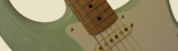
Where to find inspiration? Most design projects will include some sort of brief or branding guidelines, but when you’re working on your own projects, you start with a blank canvas. The inspiration for the colour scheme of the site came from my 50’s reissue Fender Stratocaster. It’s a Mexican copy of an all time classic, but it still has those great strat looks.
Brown and beige aren’t exactly sexy colours, but I thought they would work well in contrast with a bright green. Chris Spooner’s blog uses beiges, and I really liked this shot on Dribbble by the Dribbble man himself, Dan Cederhorn.
I decided on orange for the link colour, and to keep the main navigation and links very similar to make it clear where the links are on the page.
Layout
The layout of the site is standard for a blog-type site. The most important element to include was the elevator pitch on the home page (“A web developer based in Manchester…” etc.). These are now very common on professionals website’s, my last design included one, and they are a great way to communicate what you offer to your visitors. There is a great article from Yoast about summing up your business as succinctly as possible, which explains how an elevator pitch can help your SEO.
Development
I’m a developer so I have to write a bit about the development!
The site is built with HTML5 (I’ve written a post about how to do that) and a little CSS3. This means that my site will look different in older browsers; the large headers at the top of the pages will not have the text-shadow effect, but I’d rather include the effect for people with up-to-date browsers than use images, or not include the effect at all.
The back end of the site is running on my own PHP framework, and the beginnings of my own CMS. This means that some of the time I could be using writing for the blog ends up being used on actually building it, but its a great learning exercise and interesting to see how much functionality can be included in a CMS.
Now, if I’d got round to building the commenting functionality for blog posts, you’d be able to tell me what you think, but for now you’ll have to make do with telling me via Twitter, @npyett.
Sloppily typed by Nick Pyett


